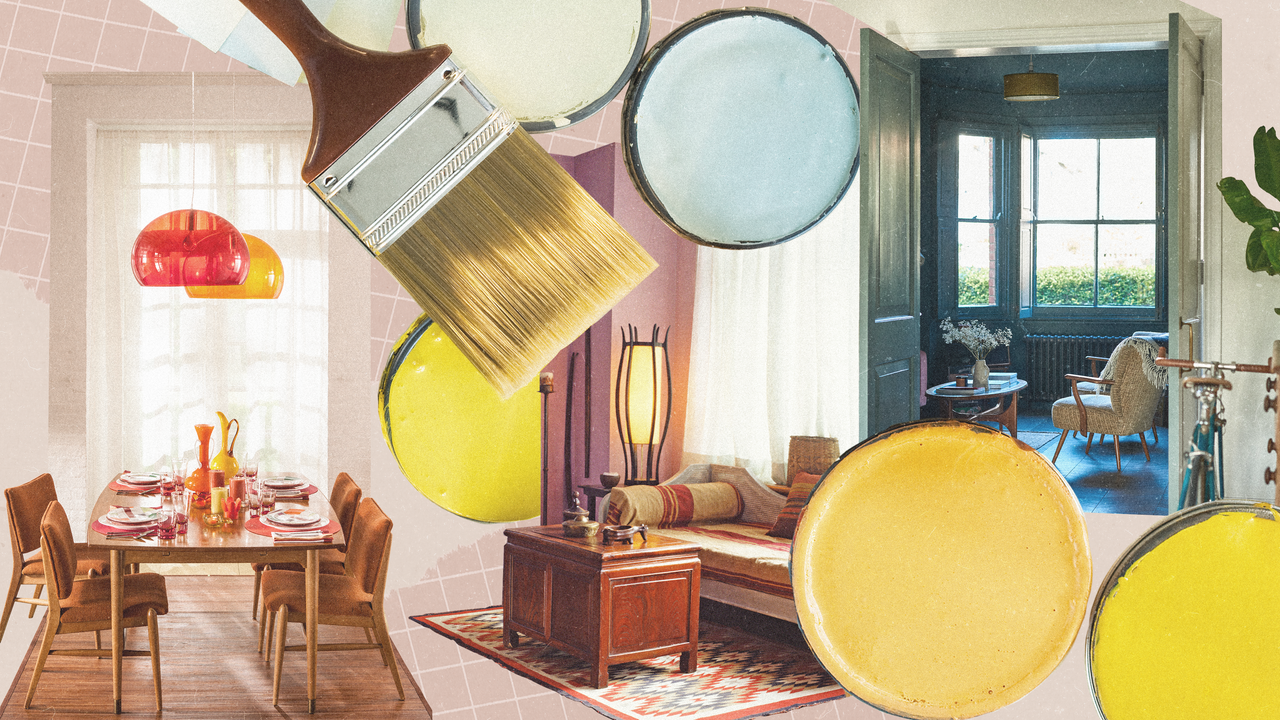
Chromatics are compelling and psychological—and their impact is perhaps that much more poignant when using analogous colors. The color scheme is derived from color theory—the study of how hues connect with one another and are perceived by the human mind—and although it sounds quite scientific, it’s more straightforward that you think. And understanding it can inform the visual approach of your interiors as well.
“Understanding basic color theory is a wonderful tool for creating color schemes,” says interior designer and color expert Diana Hathaway. “The work of understanding how to combine colors is already done for you, leaving you with the enjoyable task of choosing exactly which ones suit your style and space.”
You may have heard the term “analogous color schemes” in passing, and they have found their way into well-known works of art and branding. For example, Claude Monet’s Water Lilies series is a study in analogous colors, showcasing shades of blue, green, and purple. BP, or British Petroleum, has a flower-shaped logo that contains green and yellow hues, resulting in a yellow-green analogous palette.
But what is an analogous color scheme exactly? Ahead, designers share tutorials and helpful information so you can bring these color combinations into your own spaces.
What is an analogous color scheme?
Analogous colors are best understood when referencing the color wheel, the go-to diagram in color theory that explains how hues relate to each other. Theresa Butler of Atlanta’s Theresa Butler Interiors defines an analogous color scheme as one that utilizes two or three neighboring colors on the color wheel. In fact, the word “analogous” means similar or comparable.
Sarah Hargrave, owner and principal of The Collective in Dallas, says that an analogous color scheme’s primary focus is on color harmony.
An analogous color scheme always contains a max of three adjacent colors, as Hathaway says. “Using the color wheel, any color can be translated into an analogous scheme by choosing the colors that flank it,” she points out.
In general, analogous schemes are considered soothing, easy on the eyes, and visually satisfying. They even mirror colors that can be found in nature, such as the transition from the sky to the horizon during a sunset.
It differs from other color schemes, such as complementary schemes, which includes colors that are opposite from one another on the color wheel; triadic schemes, which includes three colors evenly spaced around the wheel; or monochromatic colors that focus on variations of a single color. There are benefits to all color schemes, though analogous ones are particularly useful in creating harmony and balance in a space.


